XSplit's Design System: Consistency across products
XSplit is a leading provider of live streaming and video-mixing software, renowned for its powerful and user-friendly tools that empower millions of content creators, streamers, and professionals worldwide. Our flagship products, XSplit VCam and XSplit Broadcaster, offer robust solutions for background removal and live broadcasting, respectively. As our user base grew, it became essential to maintain a consistent and high-quality user experience across all our platforms.
This necessitated the creation of a cohesive design system that would unify our products and website, enhance efficiency, and streamline the development process.
As a Senior Product Designer at XSplit, I spearheaded this initiative.
My Roles
- Design Systems
Timeline
- November 2021 – September 2022
Links
TLDR
2 products, 1 shared system
System expanded from VCam and Broadcaster.
~40% faster time to assembly
Estimated reduction in component assembly time after token adoption by the team.
1 source of truth
From hardcoded hex values scattered across components to a single JSON token file shared by design and engineering.
Audit and challenges
XSplit is a leader in the streaming space, but its growth led to design system debt. Broadcaster, VCam, and our website were designed and developed independently over time.
The suite is disconnected, designed in silos
Disconnected UI elements and inconsistent typography diluted our brand identity and created a steep learning curve for users moving between products.
Inefficiency
Designers were "reinventing the wheel," recreating common components for every new feature.
Development gap
Design would deliver a Figma file. Engineering would make their best interpretation. Development misalignment led to constant back-and-forth, as there was no shared technical "Source of Truth"
Accessibility was an afterthought
With no systemic approach, accessibility was checked per-component, per-feature, on a best-effort basis. There was no system to enforce it at scale.
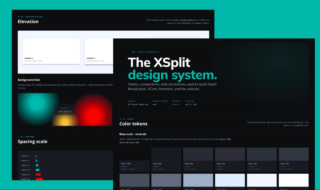
The Architecture: Building the Language Before the Library
The instinct in most design system projects is to start with components. For XSplit, we started with standardizing the design token structure. I wrote about the technical underpinnings of this approach in detail: Setting up Design Tokens for Multi-themes in Figma.
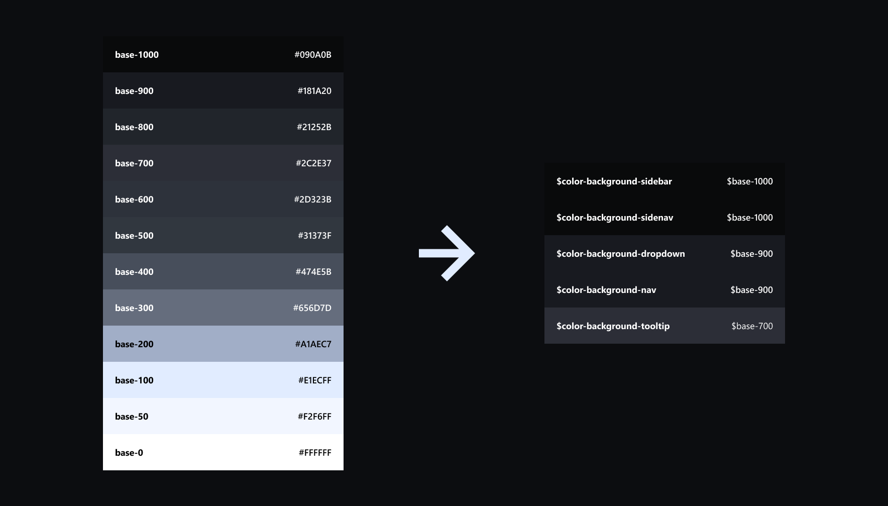
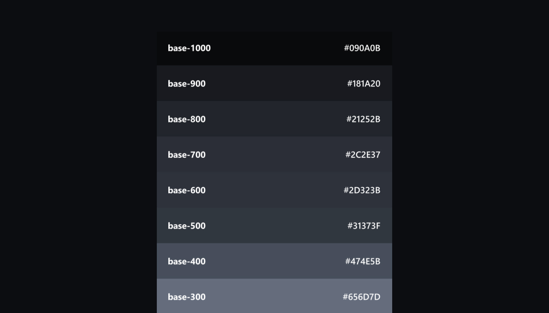
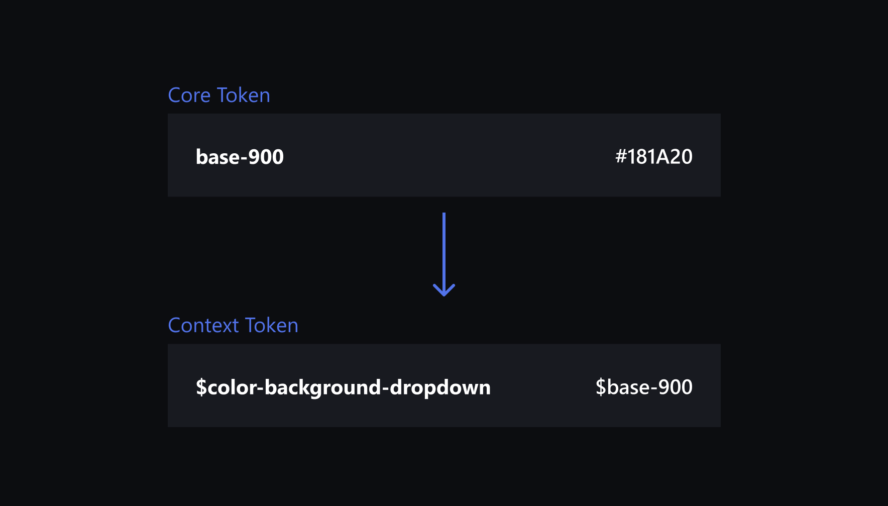
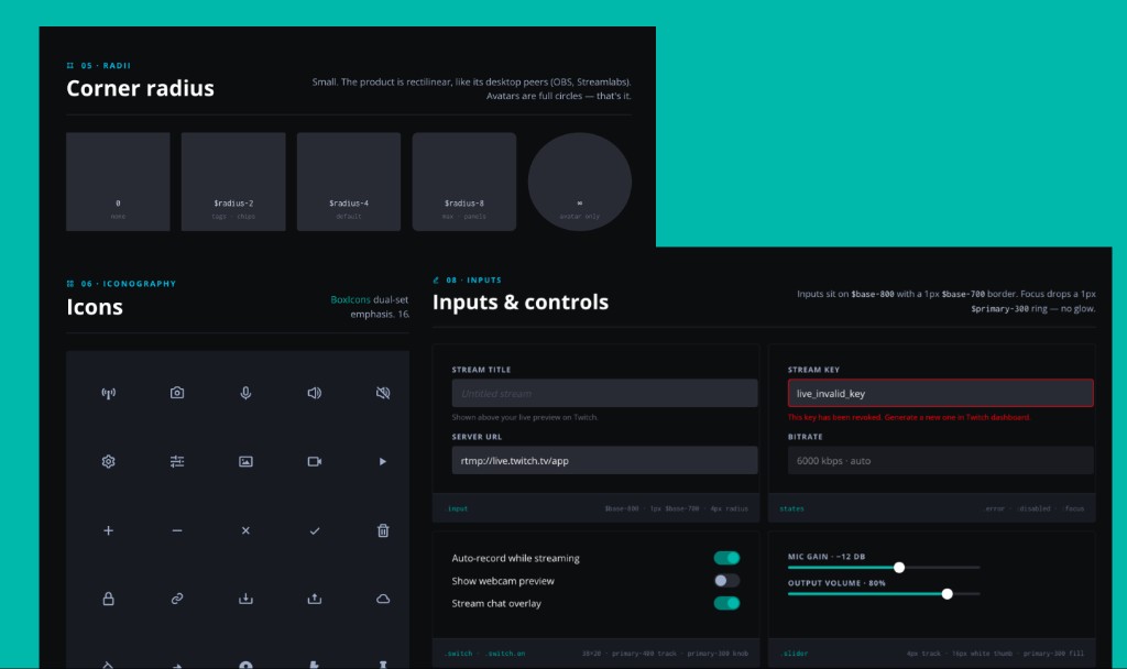
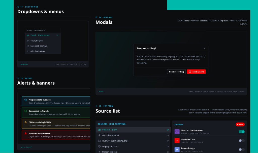
We established a tiered token architecture to decouple raw values from design intent. Core Tokens (e.g.,gray-1000) serve as our primitive constants: static values that define the palette but lack situational meaning. To prevent misuse, we implemented Context Tokens (e.g.,color-background-navbar). These alias the core values into functional definitions, explicitly communicating their intended application. By mandating that designers and developers apply Context Tokens to UI components rather than primitives, we ensured the system remained themeable and protected against breaking changes.
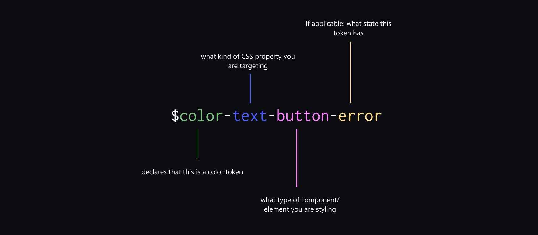
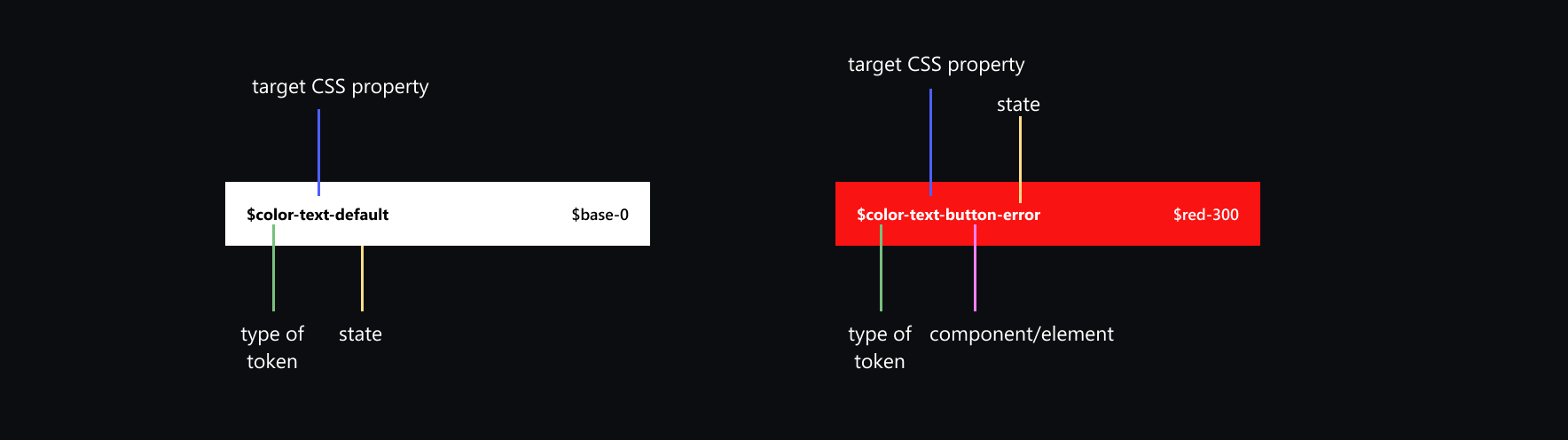
The Naming Convention as Shared Vocabulary
For Core Tokens, we adopted a numeric scale to avoid naming ambiguity. For semantic Context Tokens, names had to be as descriptive as the intent they represented.color-text-button-errortells you the surface (button), the property (text color), and the state (error) in a single read. When a developer sees that token in a stylesheet, it removes guesswork and makes intent easy to understand.
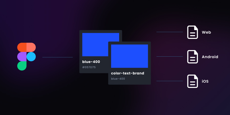
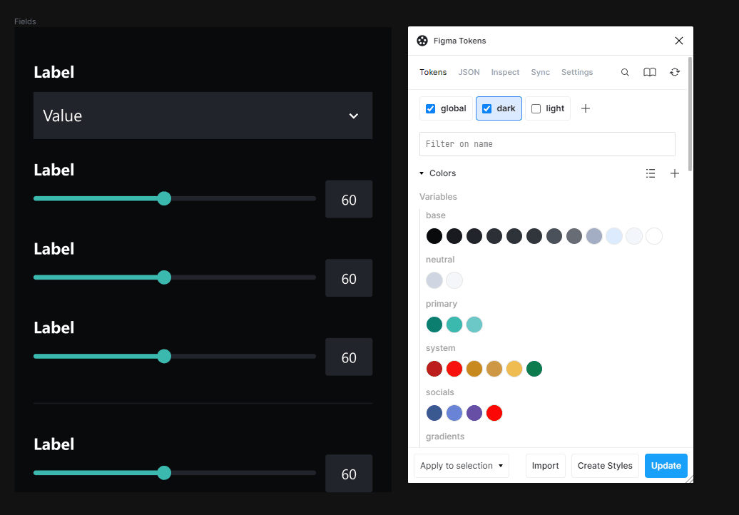
Token Management with Tokens Studio
We used Figma Tokens (now Tokens Studio) to manage the token layer in Figma, syncing token values to a shared JSON file stored in GitHub. Engineering consumed that file to generate CSS custom properties via a build step. The result: both Figma and the codebase were referencing the same source of truth, not a design file and a separately maintained stylesheet, but a single JSON file.
Multi-theme support
Multiple token sets can be toggled inside Figma, letting designers view the full design in dark or light mode without maintaining two separate files. Given this structure, a new theme later requires updating one layer of the system, not rebuilding components.The components are theme-agnostic by design.
"Hot Potato" Workflow
The "hot potato" framing, a concept I learned from Dan Mall, describes how design and development collaboration should actually work: the work moves continuously between disciplines, picking up value at each pass. No one holds the ball for too long. No one throws it over the wall.
The Old Way
Designer finishes a screen → exports a Figma file → developer opens it and makes their best interpretation → QA flags discrepancies → designer reviews → developer patches → ships. Repeat on every feature, forever. The feedback loop was slow and lossy. Each handoff degraded fidelity. Decisions made in design had to be re-explained in development, then re-corrected in production.
The New Loop
With tokens as the shared contract, the cycle became continuous:
- Design screens in Figma using library components wired to semantic token variables.
- Token values are synced to GitHub via Tokens Studio, the JSON file is always current.
- Engineering consumes the JSON, the build step generates CSS variables and custom properties.
- QA compares the design's semantic intent against the implementation - "does this surface read as
background-elevatedorbackground-overlay?", not pixels and hex codes. - If a token value needs adjusting, it's updated once in Figma. CSS regenerates. All components inheriting that token are updated.
The JSON file is the single source of truth. Not the Figma file. Not the CSS. Both sides read from the same contract.
The Impact: Infrastructure, not just a UI kit
The test of any design system is whether it becomes invisible, whether teams stop thinking about the system and start thinking through it.
Time to Assembly
The design system acted as a force multiplier for our product teams. By establishing a shared library of pre-validated components, we drastically reduced the 'Time to Assembly.' Designers no longer spend cycles on low-level UI decisions; they now focus on complex user flows, knowing that the foundational layer is already technically sound and accessible.
Accessibility as a default
WCAG contrast ratios were validated and baked into semantic token pairings during the audit phase.color-text-defaultapplied overcolor-background-surfacepassed AA contrast requirements by definition - because we checked that pairing at the token level, once, rather than per-component, per-feature. Accessibility stopped being audited reactively and started being guaranteed structurally.
Scalable by Design
The implementation of this multi-tier token architecture provides the foundation for long-term ecosystem growth. By decoupling design intent from raw values, XSplit is now positioned to integrate new products seamlessly and execute comprehensive theme transitions—such as localized branding or accessibility modes—with minimal engineering overhead.