Setting up Design Tokens for Multi-themes in Figma
Create Design Tokens from Figma, convert them to JSON, and how to set them up for multiple themes with Figma Tokens
A Design System is an effective way to maintain consistency throughout a project. In Figma, we often make component libraries that are used across design files and Figma has done a great job in terms of handling that part of Design Systems. Though there is one thing lacking: it needs improvement in handling Design Tokens. In this article, we’ll go over what design tokens are, how we create them from Figma, and how we prepare Design Tokens for multiple themes using a plugin called Figma Tokens.
What are Design Tokens?
Design Tokens are the atoms of your Design System. They are basically named entities that store design attributes (Ref: Lightning Design System). They are usually in the form of JSON and it lists all the information about your UI like color, typography, shadows, borders, etc. It acts as the source of truth that’s shared across different parts of your project, from Figma to front end development.
Benefits of Design Tokens
- Better handoff process
- Consistency across the board, from design to development
- Scalability
- Less guess work. As a developer, Instead of thinking what shade of gray you need for a text, you can just refer to a specific context token like
color-text-headerorcolor-text-body.
What can you declare as Design Tokens?
What you declare as a design token will depend how granular you want the tokens to be, which can vary from one project to another. Some of the basic Design Tokens are:
- Colors
- Typography
- Border
- Shadows
- Sizing
- Spacing
- Opacity
… and more!
So aren’t they just CSS variables?
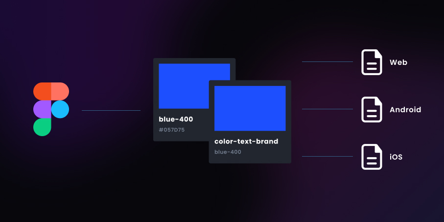
Not exactly. It’s a separate file (JSON or YAML) that is agnostic and can be read by any codebase. This means that Design Tokens can be used as referenced for CSS Variables and can also be used in Android, IOS, CSS-in-JS, and wherever JSON is readable or convertible.
Understanding Core and Context Tokens
To create Design Tokens in general, we need to understand what are Core Tokens and Context Tokens. These types come in different names, but I went with these names since they make sense within the projects I'm working on.
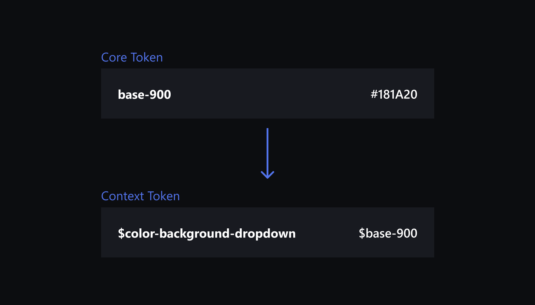
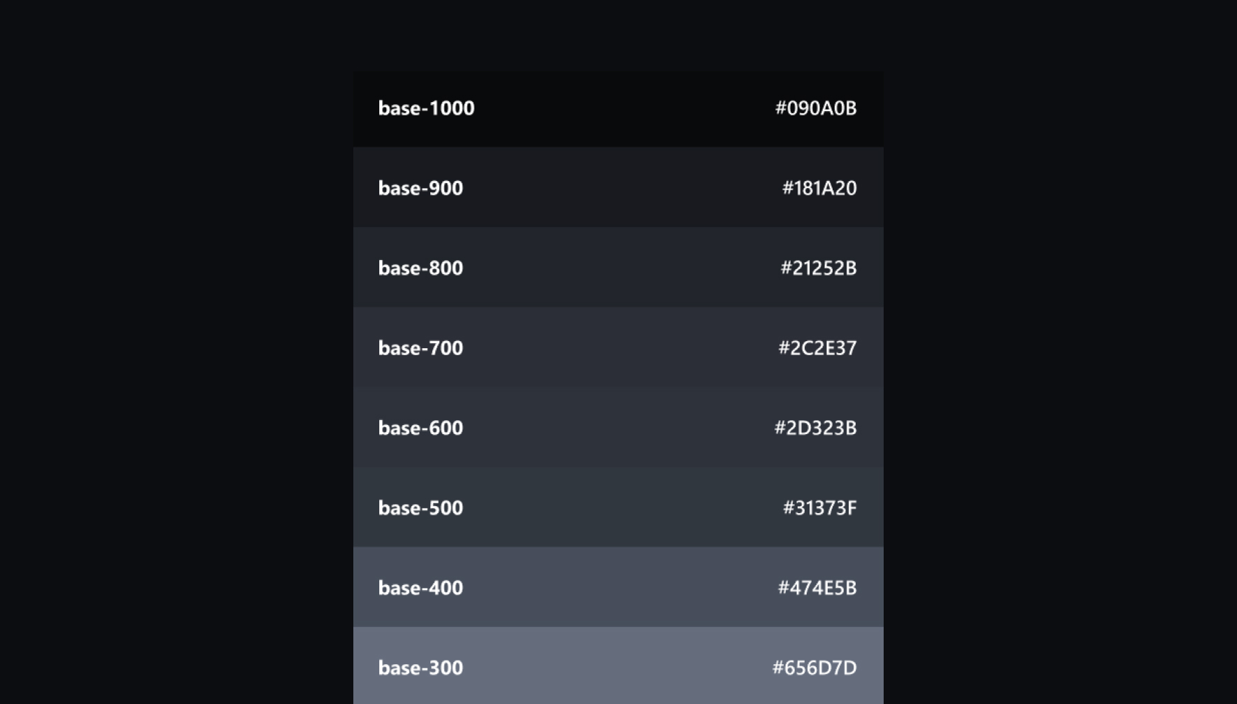
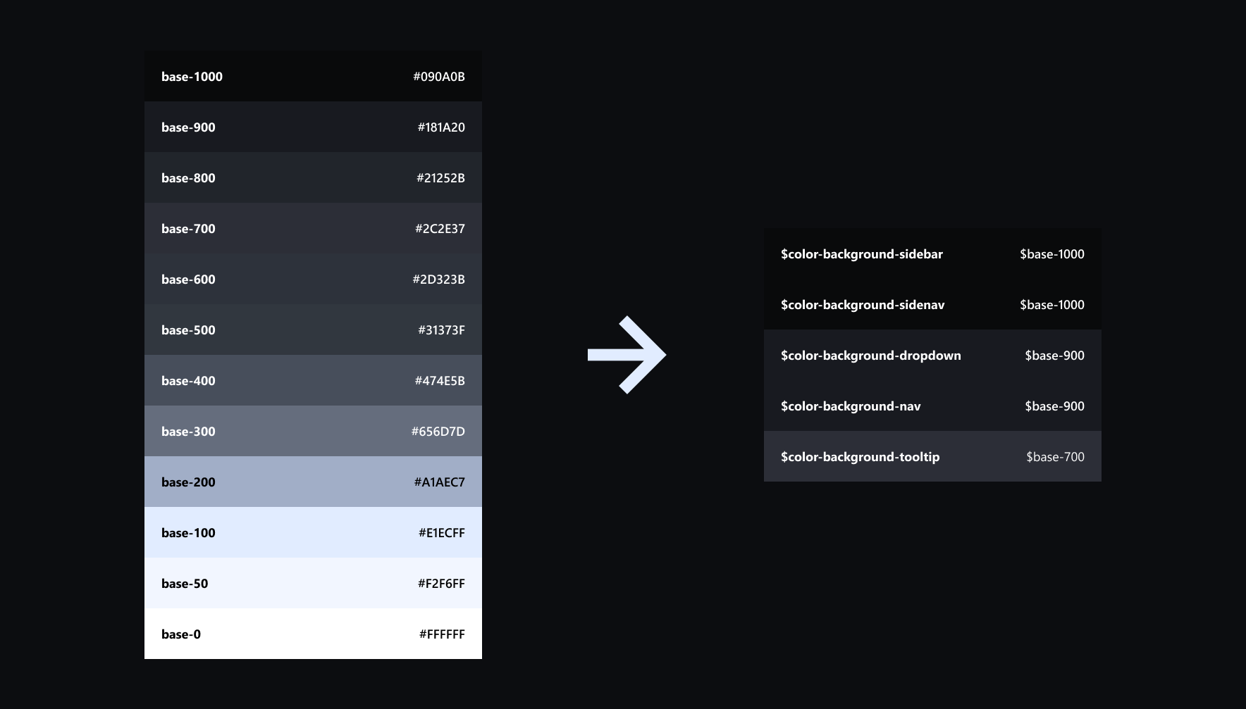
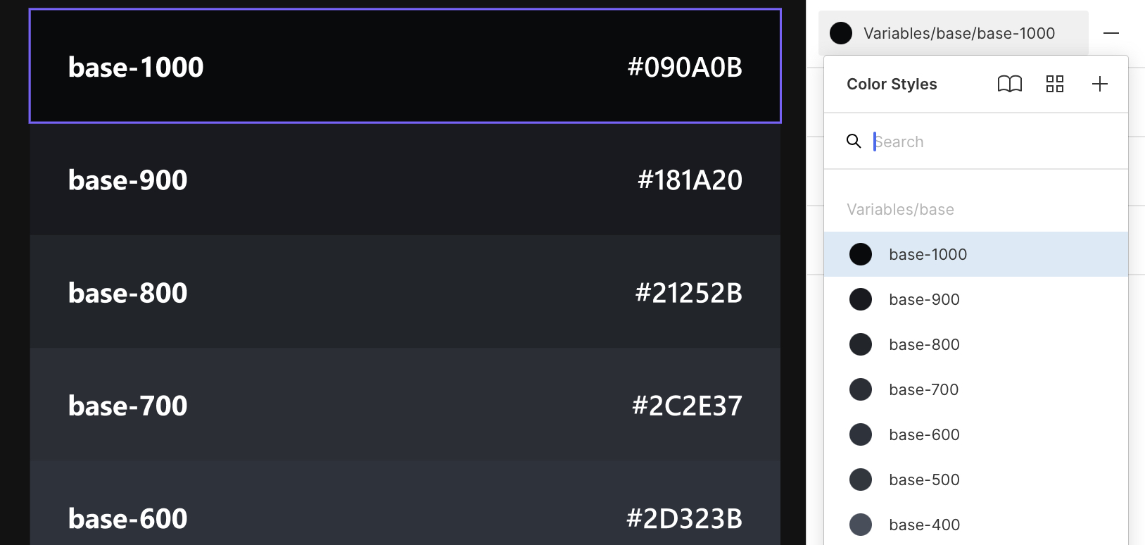
Core Tokens are like your base variables that takes a defined value, like gray-1000. Though they can be used as is, it doesn’t tell us where exactly it can used. A gray-1000 token can probably be used for texts, backgrounds, borders, and more, but I wouldn’t recommend using them for specific components.
Context Tokens on the other hand references from Core Tokens and specifically made for it’s use case like a background or border colors of a component, text color of a header or paragraph, etc. It should communicate where the token it’s supposed to be used like color-background-navbar. Ideally, Context Tokens are what you apply to actual UI Components, not Core Tokens.
Both Token types have a strict naming convention
Initially, the team needs to standardize a naming convention for their tokens. Discuss with your dev team what’s the best naming convention that works with your project.
For Core Tokens, I would usually go for a numeric scale naming convention. This avoids having to name Tokens in light-gray, lighter-gray, dark-gray etc. which can be limiting. What happens if you suddenly have something lighter than your lighter-gray? Through a numeric scale naming convention, we can provide a range of colors from lightest to darkest without having to think so much about what name it should have. You may often see this now in modern web/app development frameworks and systems like in TailwindCSS, Material Design, Lightning Design System etc.
Context Tokens however are entirely different. This type of token is more specific and it’s name should reflect that. They should be as descriptive as possible. Here’s a sample for colors:
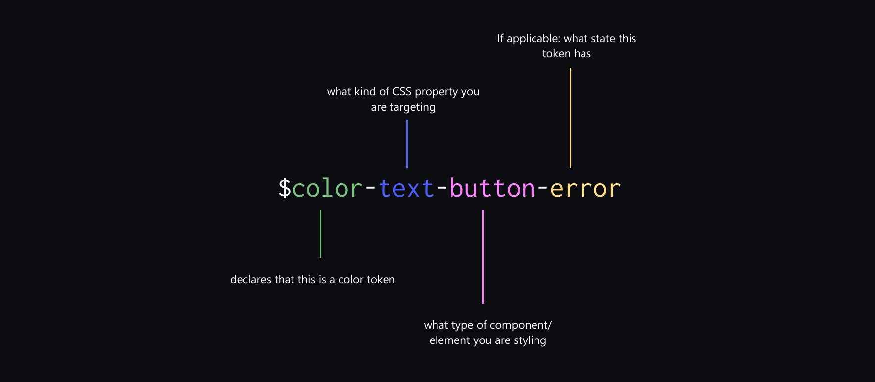
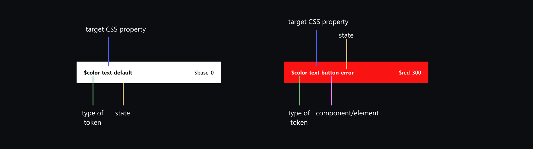
In these examples, it’s very descriptive and you’ll immediately know where it’s used for: a color-text-button-error is the color of the text for a button with a state of error. A color-text-default token says that this is the default text color. Same can be done with backgrounds: color-background-navbar, color-background-input, etc.
But how do we exactly make Design Tokens from Figma?
In some projects made in Figma, some may have probably set some “Design Tokens" in the form Color Styles, Text Styles, and Effects Styles, which are styles that you can use for your components.
In most cases these Styles are documented somewhere and the dev team would translate them to CSS variables and possibly some mixins. We can take that up a notch through Design Tokens as JSON, but how can we do that from Figma?
Using Figma Tokens
Figma Tokens is a plugin by Jan Six that addresses how Design Tokens can be best managed in Figma. I would advice to read the documentation for a more detailed explanation on it’s features and how to use it.
Some notable features:
- Easily imports all your Figma Styles (Color, Text, Shadows) and converts it to JSON.
- Smart aliases or ability to reference a token for another. Meaning you can use Core Tokens for your Context Tokens!
- Theme switcher. Customize it however you want.
- Syncs your Design Tokens in Github or JSONBin, making it a shared file between design and development.
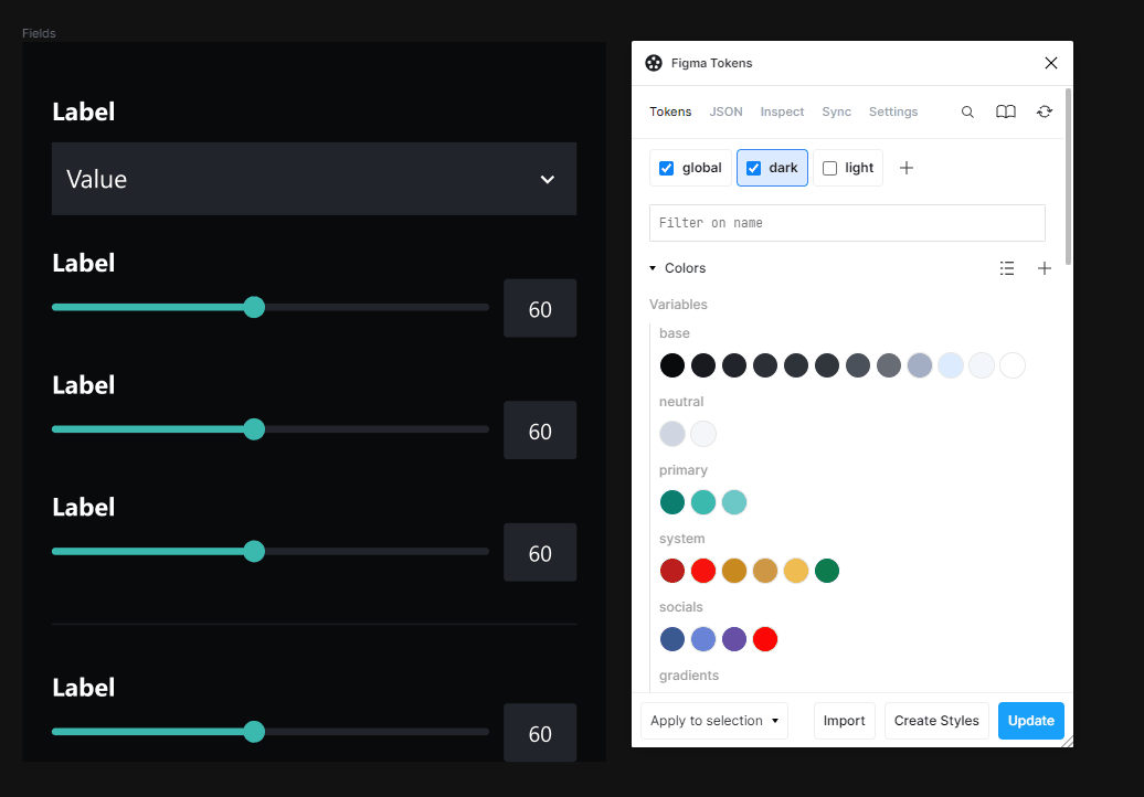
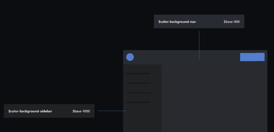
Set your Context Tokens for Dark and Light Mode
By clicking the + icon on Figma Tokens, it allows you to create a new theme. Now you just need to set what value your Context Token will have for each type of theme: your color-background-sidebar would probably be a base-1000 for dark mode, and maybe a base-0 for light mode.
Next Steps
Now you have Design Tokens, in a form of JSON file for every theme you want to make, the next step is how this will be implemented in code. Admittedly, my experience in this part of the process is limited to CSS. You can try CSS-Vars-from-JSON which basically allows you to generate CSS custom properties (variables) from JSON.
For example,
{
  "font": {
    "family": {
      "primary": "Inter"
    }
  }
}
can be used as,
p {
  font-family: var(--font-family-primary);
}
Now both your design and development side are now referencing from the same Design Token JSON file!
Conclusion
Design Tokens may probably seem tedious and daunting especially if you have to think of every possible token that your project needs. It is somewhat complicated, and a really high level of attention to detail and care, but the benefits of it in terms of handoff, scalability, collaboration, and consistency makes it worth it.